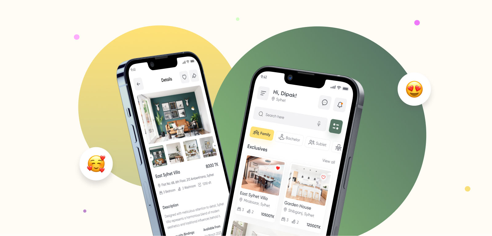
RentFinder app cover - property browsing and listing detail screens
Case Study, Real Estate

RentFinder - Simplifying Property Rentals

A premium home rental app built for Bangladesh, designed to make finding a verified, trustworthy rental faster for students, professionals, and families.

Timeline
May – June 2023
Role
UI/UX Designer
Industry
Real Estate
01
Project Overview

Renting a home, without the guesswork.

Finding a place to rent is usually slow and stressful. RentFinder set out to change that with a premium home rental app built specifically for Bangladesh.

Whether the user is a student, a young professional, or a family, RentFinder was designed to simplify the entire rental journey, from search through to move-in.

02
Research

Renters didn't trust what they saw online.

Interviews with renters across Dhaka and Sylhet surfaced the same complaint again and again: listing photos rarely matched reality, and there was no way to trust a property before visiting in person.
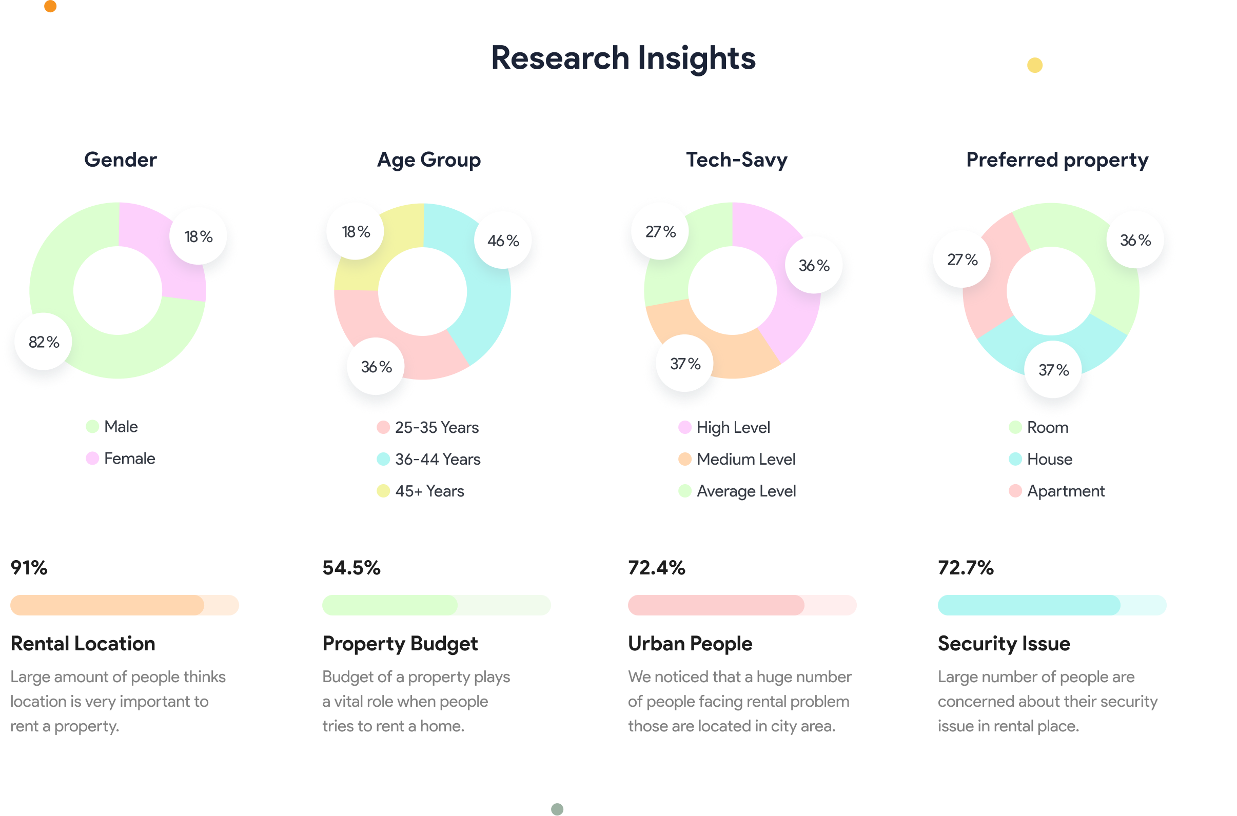
Survey data from renter interviews, shown as a set of donut charts
Self-reported survey results from renter interviews
03
User Personas

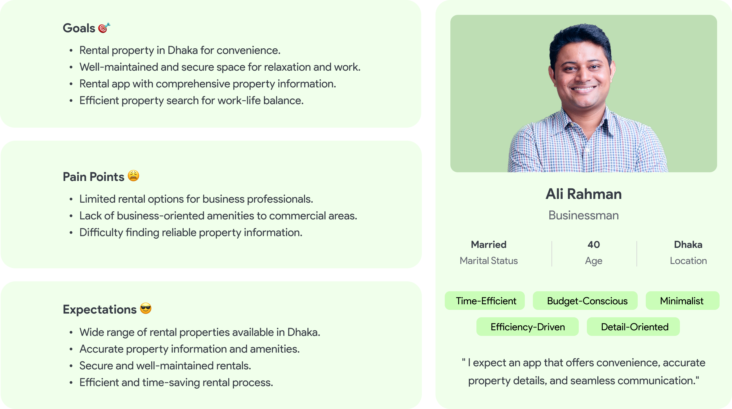
Designing around two real kinds of renters.
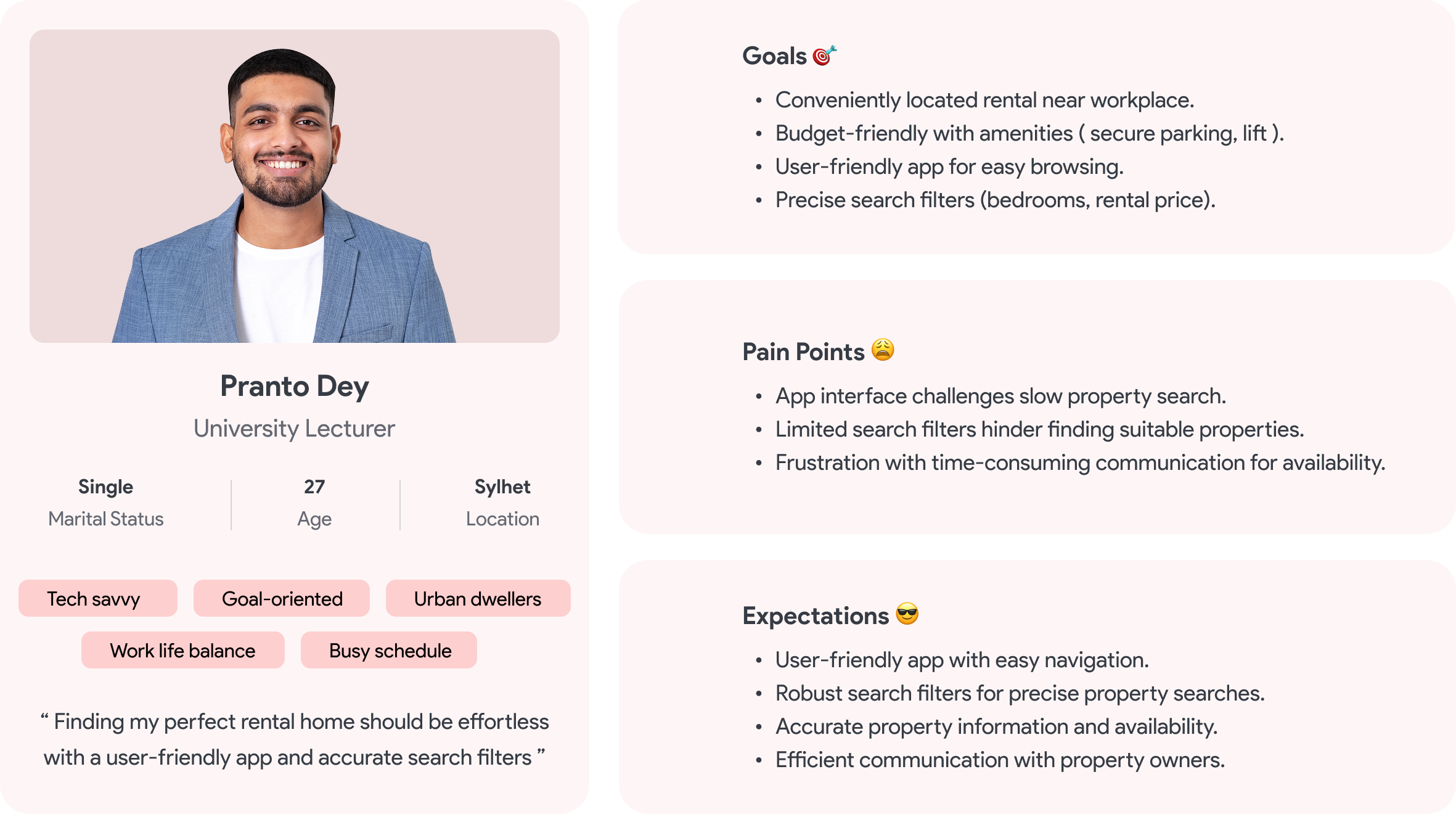
User persona 1 placeholder image
User persona 2 placeholder image
04
Findings

Eight problems, and what I did about each.

FindingsStatus
Listings weren't verified, so photos and descriptions often didn't match reality.
Problem
Property listings on the market were limited in number and variety.
Problem
The app experience created a language barrier for non-English speakers.
Problem
Property information was often inadequate to make a confident decision.
Problem
Searching for the right property in the right area was difficult.
Problem
The rental process itself lacked transparency between owner and tenant.
Problem
Payment options for rent were limited.
Problem
Property owners had few tools to manage their own listings.
Problem
Built a verification system for both property owners and tenants.
Solved
Made it easy for owners to upload and manage their own listings.
Solved
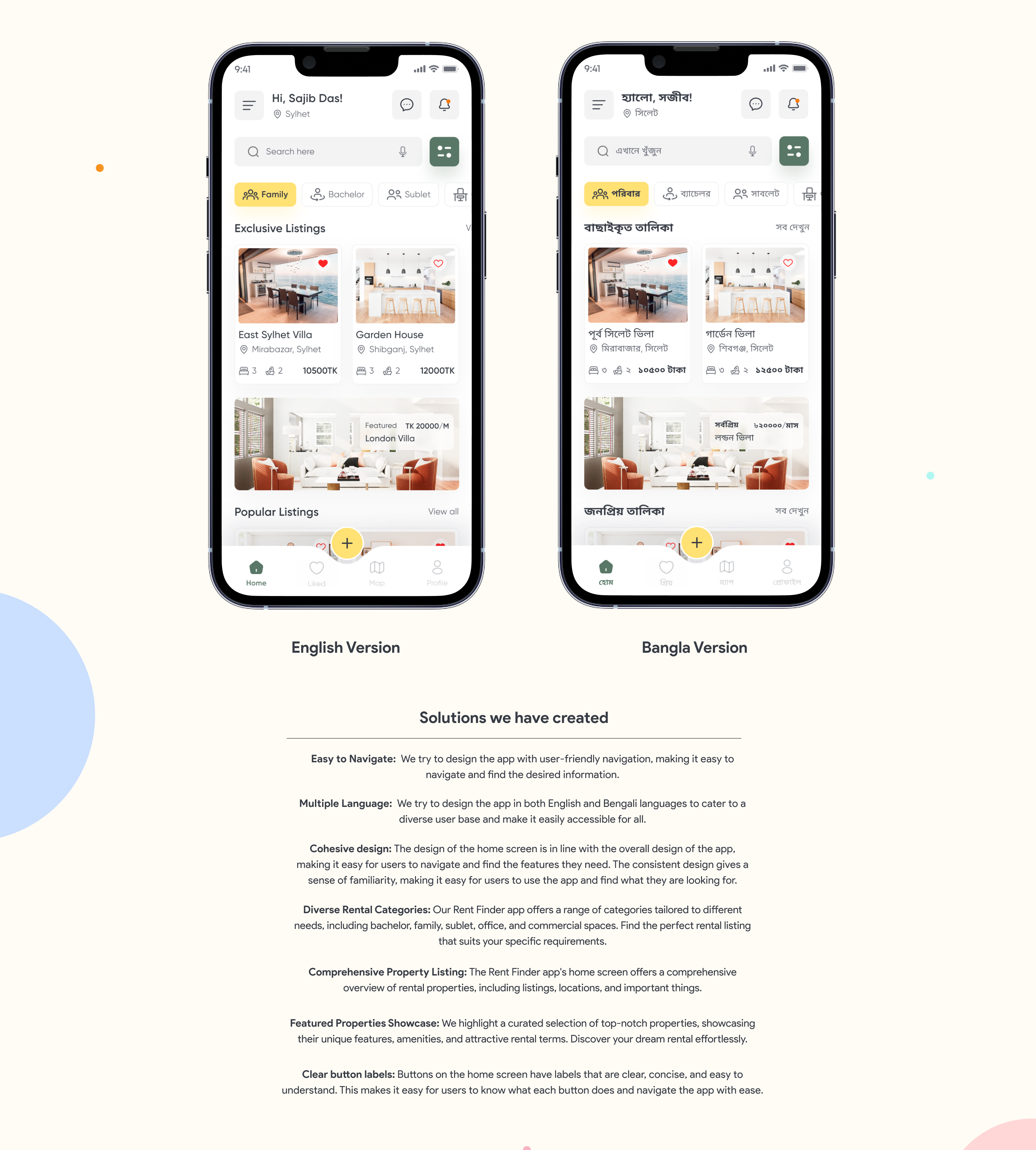
Added a multilingual interface, including English and Bangla.
Solved
Encouraged clear, high-quality photography on every listing.
Solved
Added map-based search so users can browse by specific area.
Solved
Enabled in-app communication between owners and tenants.
Solved
Integrated multiple payment gateways for more flexible payment.
Solved
Gave owners tools to manage listings and track inquiries.
Solved
05
Design Process

Research first, design second.

Every phase of the process stayed centered on the user, moving from research through definition, ideation, design, and evaluation before anything shipped.
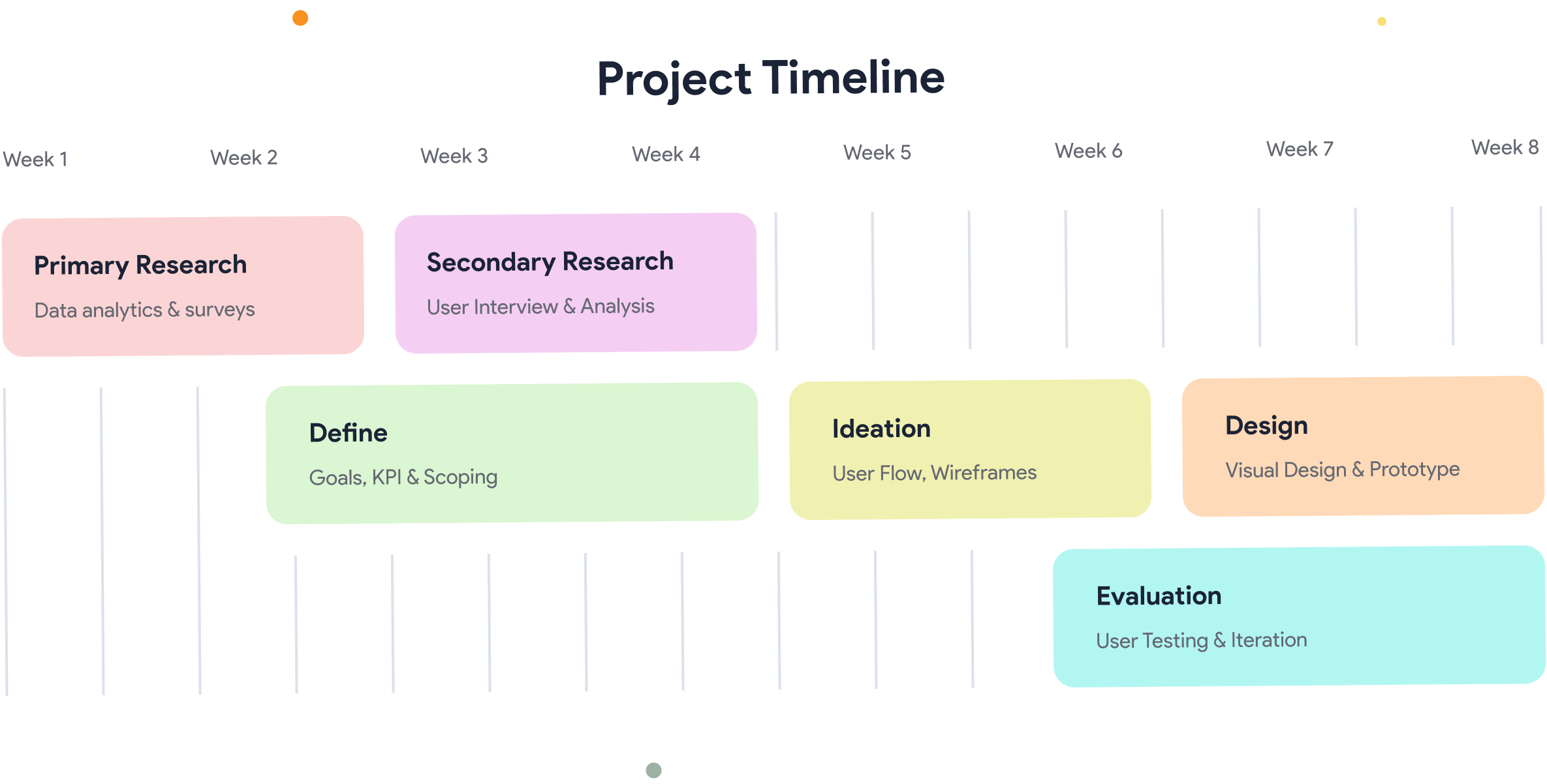
Design process: Primary and Secondary Research, Define, Ideation, Design, Evaluation
06
Visual Design & UI

Large photography, honest pricing, map-first search.

The interface favors large, honest photography, clear pricing up front, and a map-first layout, so location and commute are obvious before anything else.
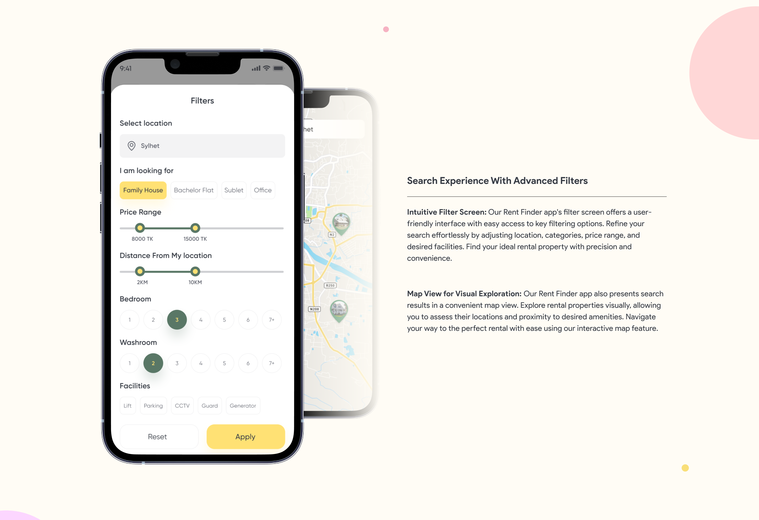
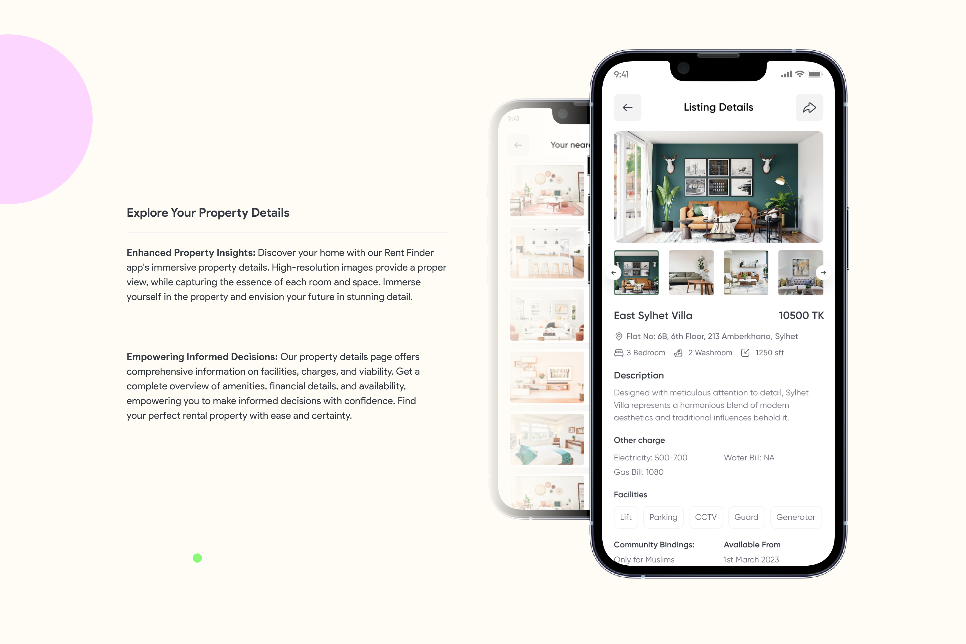
Filter panel and map-based property search
Filters and map-based search
Listing detail screen with photos, pricing, and facilities
Listing detail, with facilities and pricing up front
Home screen shown side by side in English and Bangla
English and Bangla versions, side by side
Style Guide

Typeset in clean negative-tracked sans-serif, with a warm, grounded color palette meant to feel trustworthy rather than flashy.

Primary Yellow
#FFE174
Deep Green
#597766
Light Green
#84B777
Warm Tan
#CFB48B
Slate
#656872
Ink
#363B44
07
Full App Gallery

The rest of the app.

Beyond the core flows shown above, the app was designed end to end onboarding, listings, messaging, payments, and property management.
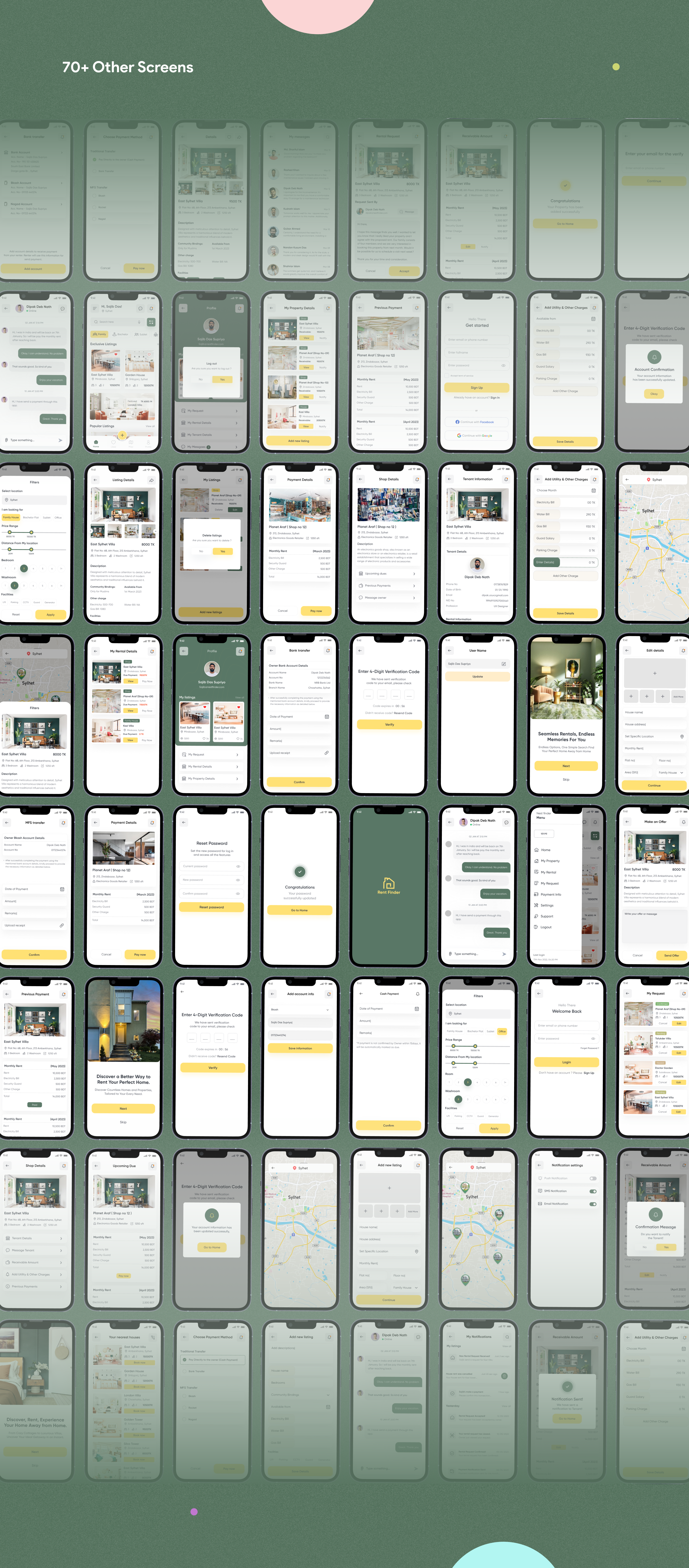
Composite grid of the full RentFinder app screen set
08
Key Takeaways

What this project reinforced.

01
Verification builds trust faster than polish

A simple "verified listing" badge, backed by real inspection, reduced drop-off far more than visual refinements did.

02
Combine filters, don't stack them

Letting users filter by commute time, budget, and amenities in one pass cut search sessions down noticeably.

03
Timelines and feedback loops matter

Finding the right interview candidates was harder than expected, but sticking to a self-imposed timeline and folding in user feedback along the way kept the project moving and sharpened the final design.

Want the fuller, more visually polished version of this case study? View it on Behance →