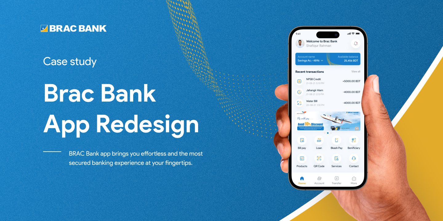
BRAC Bank - Mobile Banking UX Redesign
BRAC Bank's app brings effortless, secure banking to your fingertips - this redesign focused on unifying accounts, simplifying transfers, and making the app feel modern and trustworthy.
One of Bangladesh's largest banks, reworked for everyday use.
BRAC Bank is a leading commercial bank in Bangladesh, serving millions of customers through its branch network and digital channels. Its mobile app sits at the center of that digital strategy, so this case study looks closely at the app's design, features, and overall experience and what a redesign could do for it.
I rebuilt the app around a refreshed interface and a few key upgrades: unified account management, a simplified transfer flow, and personalized product recommendations, All aimed at boosting customer satisfaction and supporting the bank's broader digital transformation.
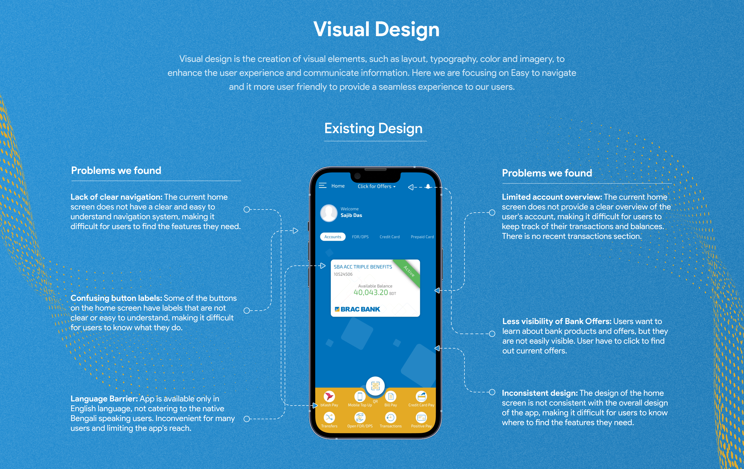
Finding out where the friction really lived.
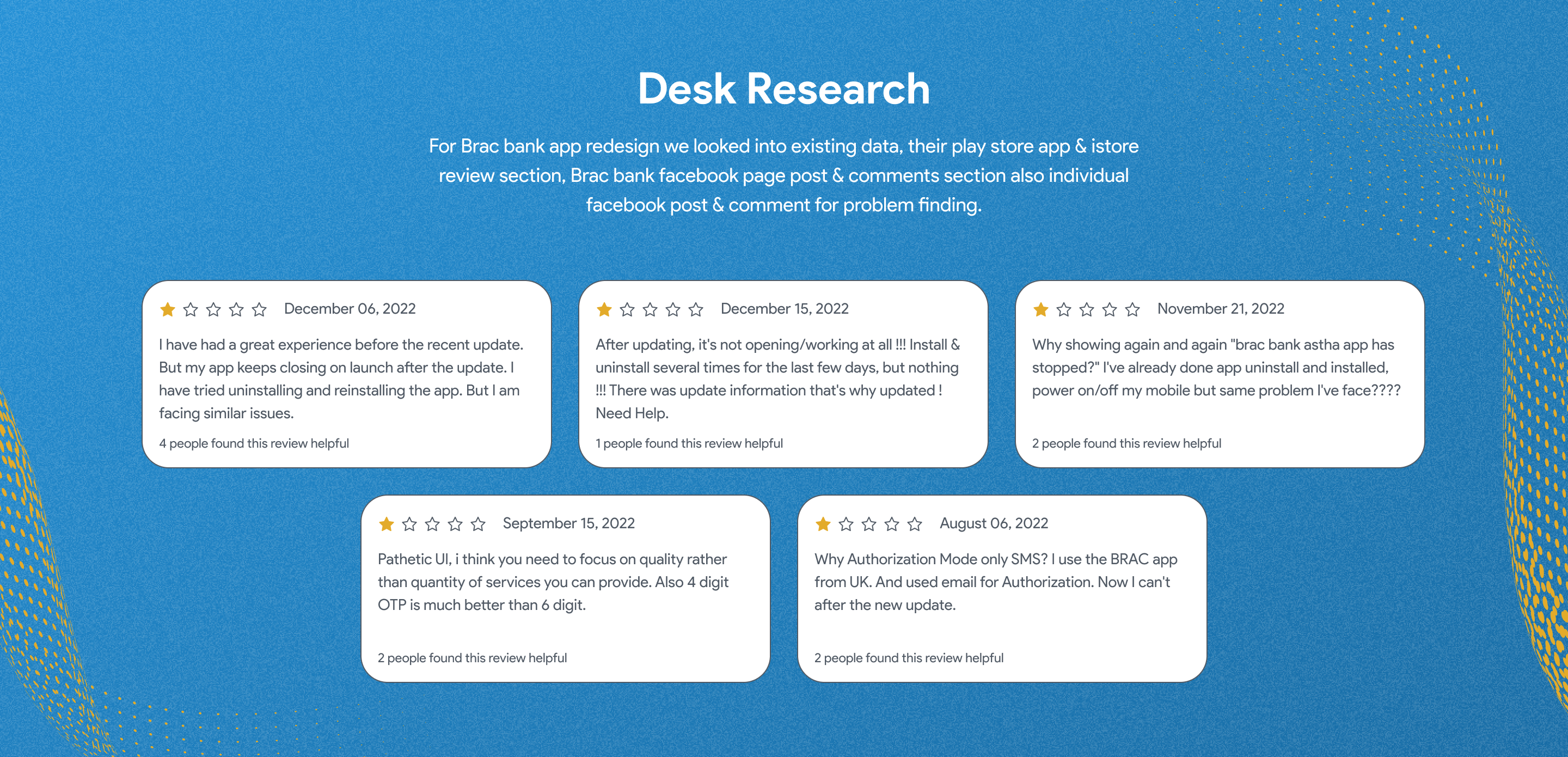
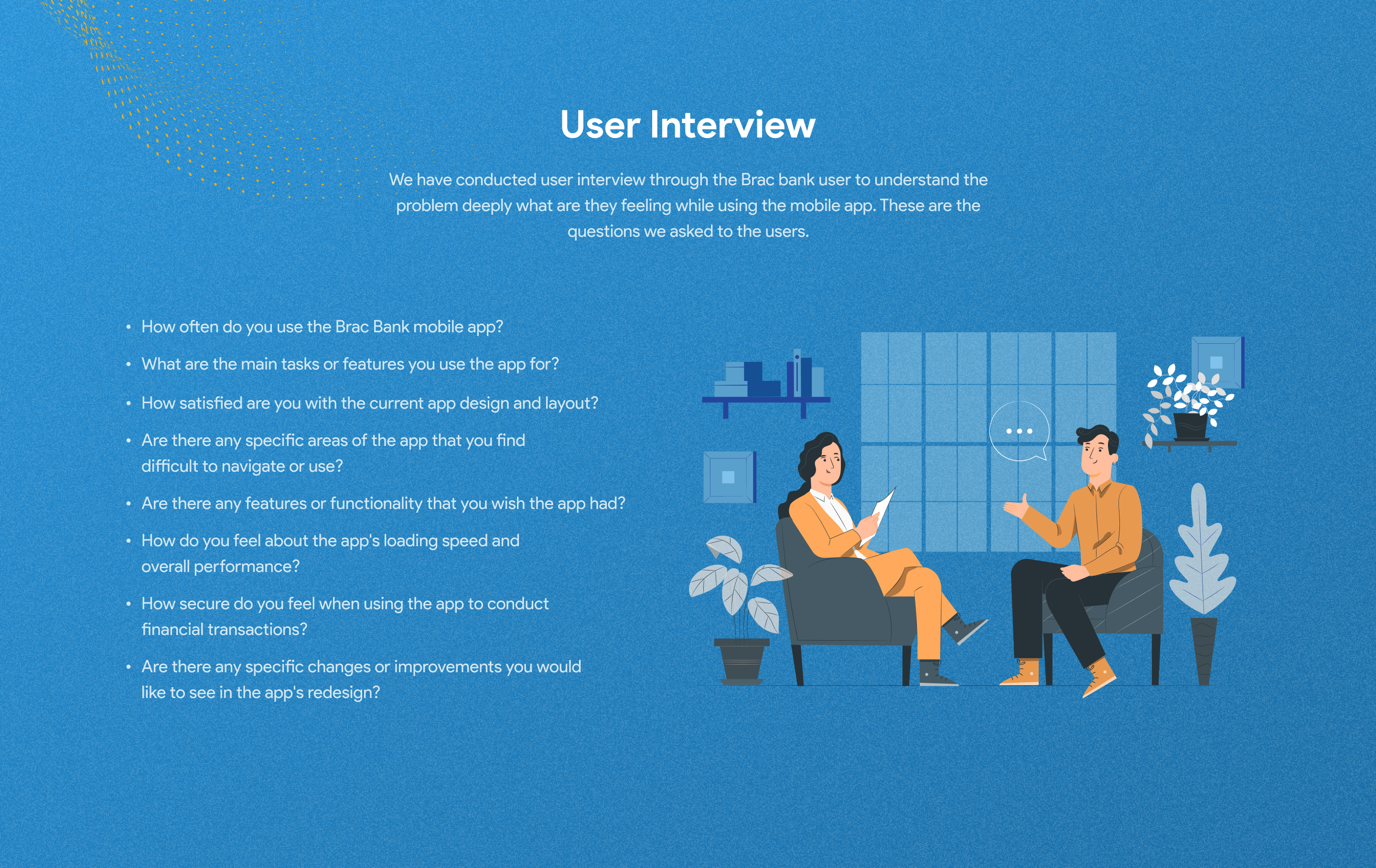
Before touching the interface, I spoke with existing app users and mapped the current account, transfer, and recommendation flows. I also went through App Store and Play Store reviews, along with BRAC Bank's Facebook page and post comments, to see where real users were getting stuck.
Designing around one real kind of customer.
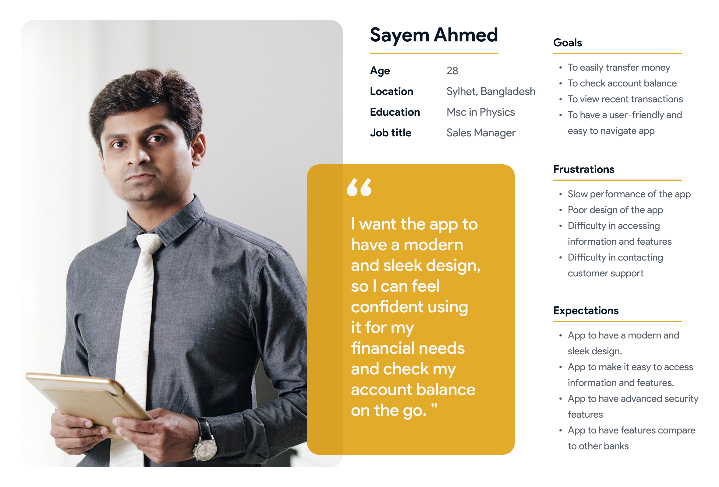
Says
"Why do I need four taps just to send money to my brother?"
Thinks
Worries about mistyping account numbers during transfers.
Does
Checks balance multiple times a day; avoids the app for anything beyond the basics.
Feels
Anxious about security, impatient with slow loading screens.
What I found, and what I proposed.
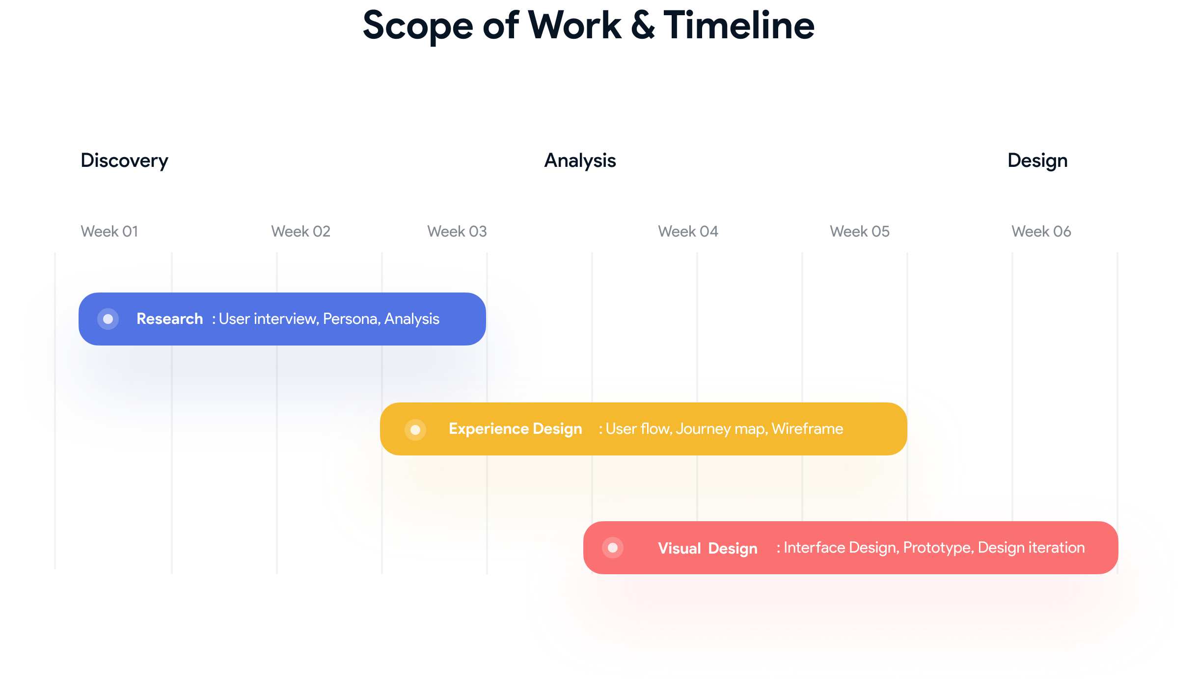
Six weeks, three phases.
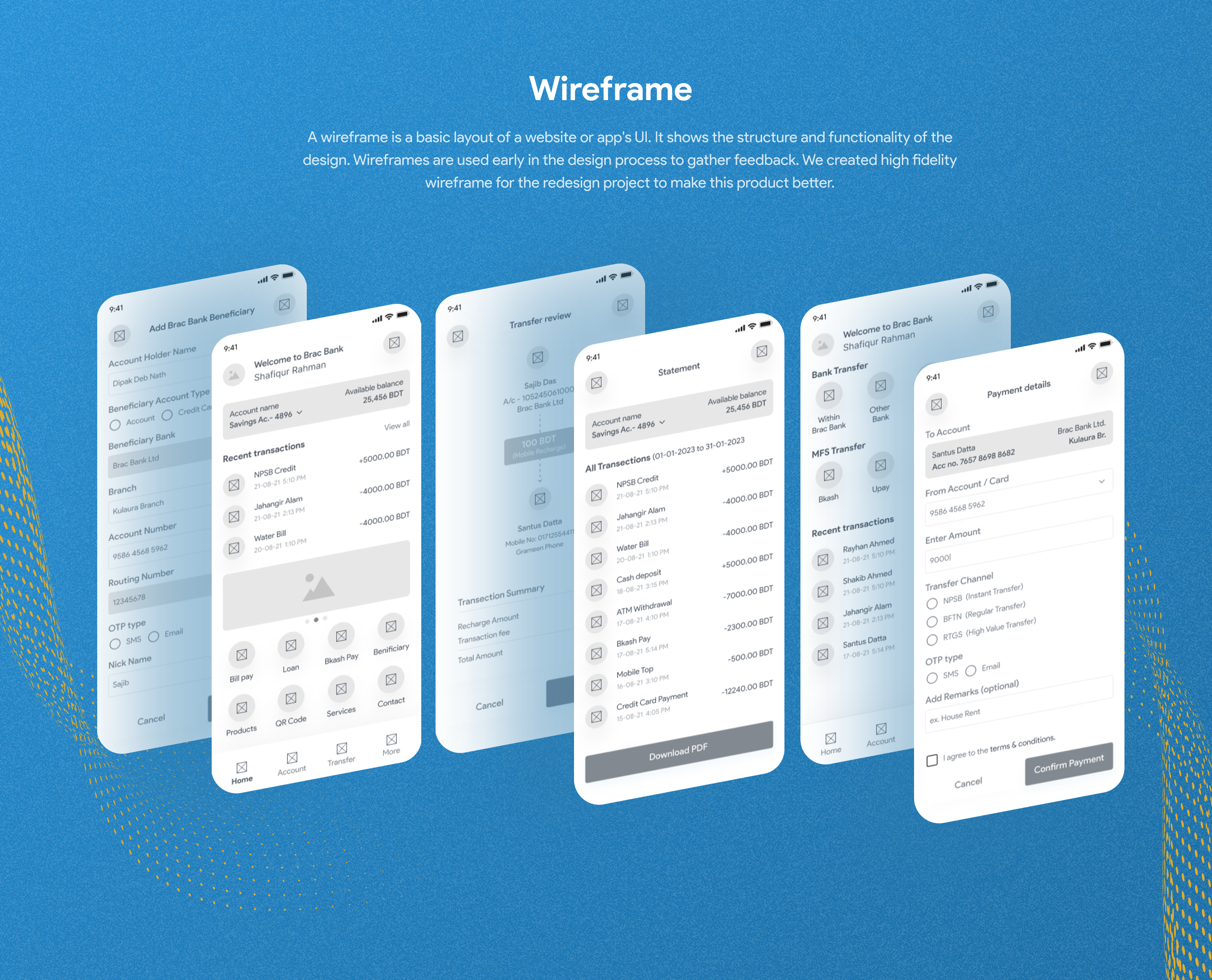
Research and persona work came first, followed by experience design, user flows, journey mapping, and wireframes before moving into visual design and prototyping.
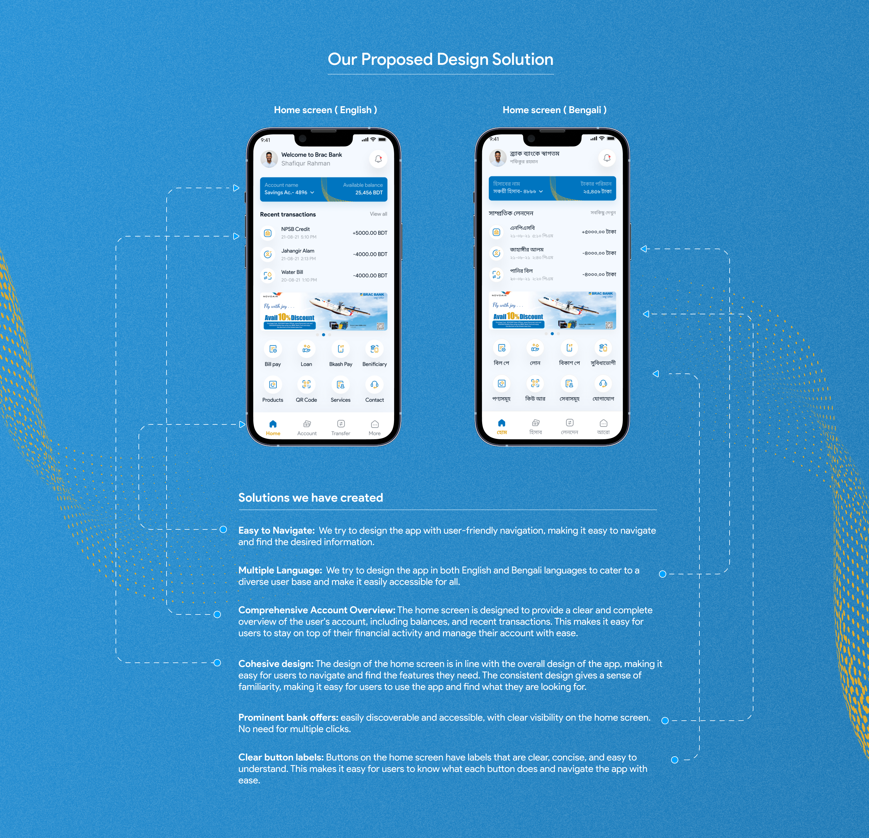
Built on BRAC Bank's own brand blue.
The visual system leans on BRAC Bank's brand blue, paired with generous whitespace and clear typographic hierarchy, so account numbers and balances stay scannable at a glance.
The rest of the app.
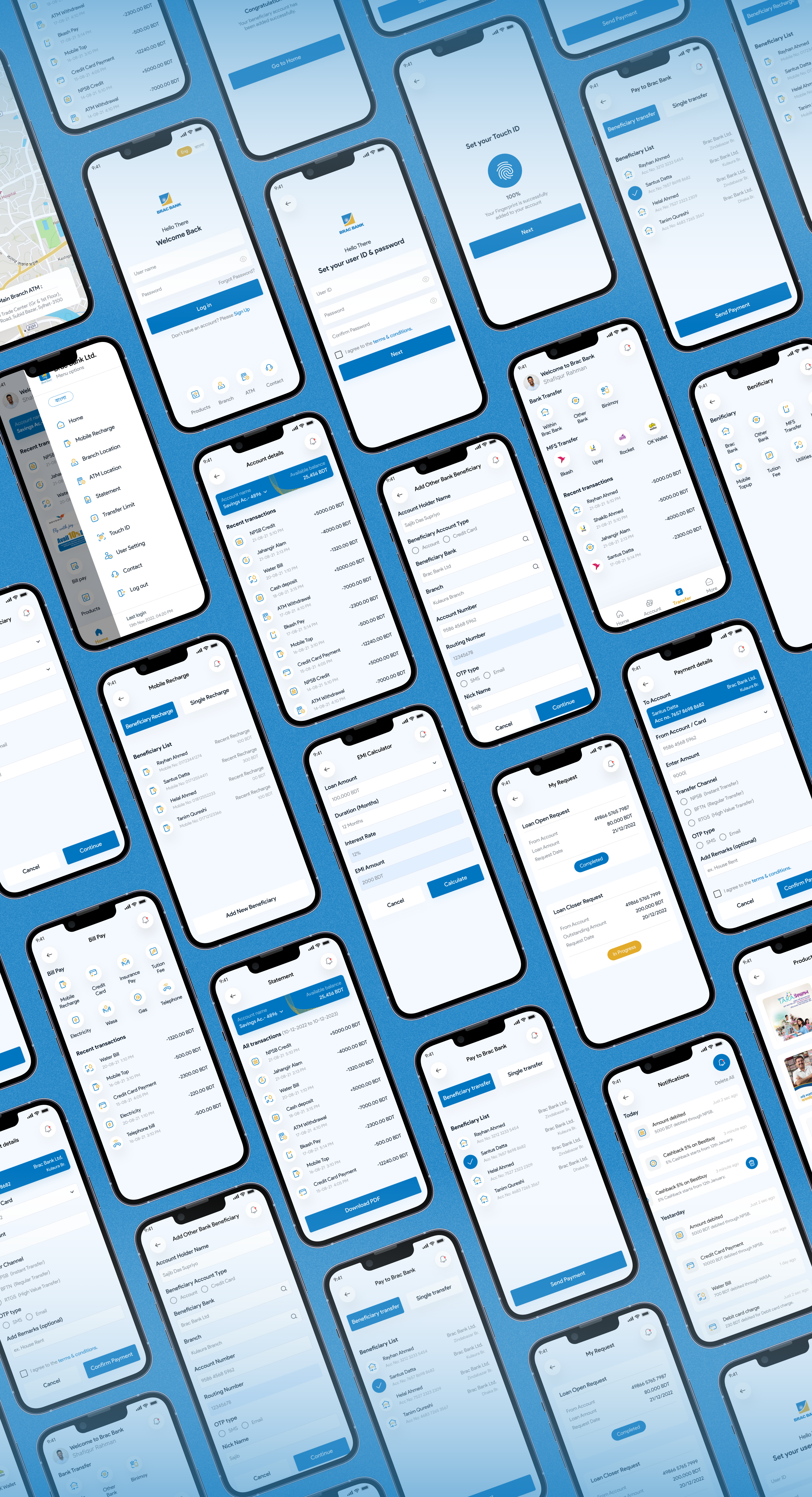
Beyond the core flows shown above, the redesign covered the app end to end onboarding, transfers, bill pay, loans, notifications, and more.
What this project reinforced.
Unify before you decorate
Consolidating accounts into one dashboard mattered more to users than any visual polish. It removed the biggest daily friction point first.
Shorten the path to money movement
Cutting the transfer flow down, with saved beneficiaries, was the single change users mentioned most in follow-up interviews.
Personalization needs real data
Recommendations only felt useful once they were grounded in actual spending patterns rather than generic product pushes.